Colour Psychology
Hello everyone, and welcome to this week's marketing challenge!
Why do fast‑food restaurants love red and yellow? Why are banks often blue? Today, you’ll read a short article about colour psychology, complete several reading tasks, and then write your own colour proposal for a real product.
Step 1: Warm-up vocabulary
Match the words (1–8) with their definitions (A–H). Write your answers in your notebook.
1 Shade A. A feeling that you need to do something quickly
2 Hunger / Appetite B. A type of colour (e.g., dark red, light blue)
3 Trust C. The desire to eat
4 Urgency D. To change or influence something
5 Affect E. Calm, not worried, safe
6 Peaceful F. Belief that someone or something is honest
Step 2: Reading Time
Read the article carefully. Pay attention to how colours influence emotions and decisions.
Colour Psychology: How Marketers Hack Your Brain
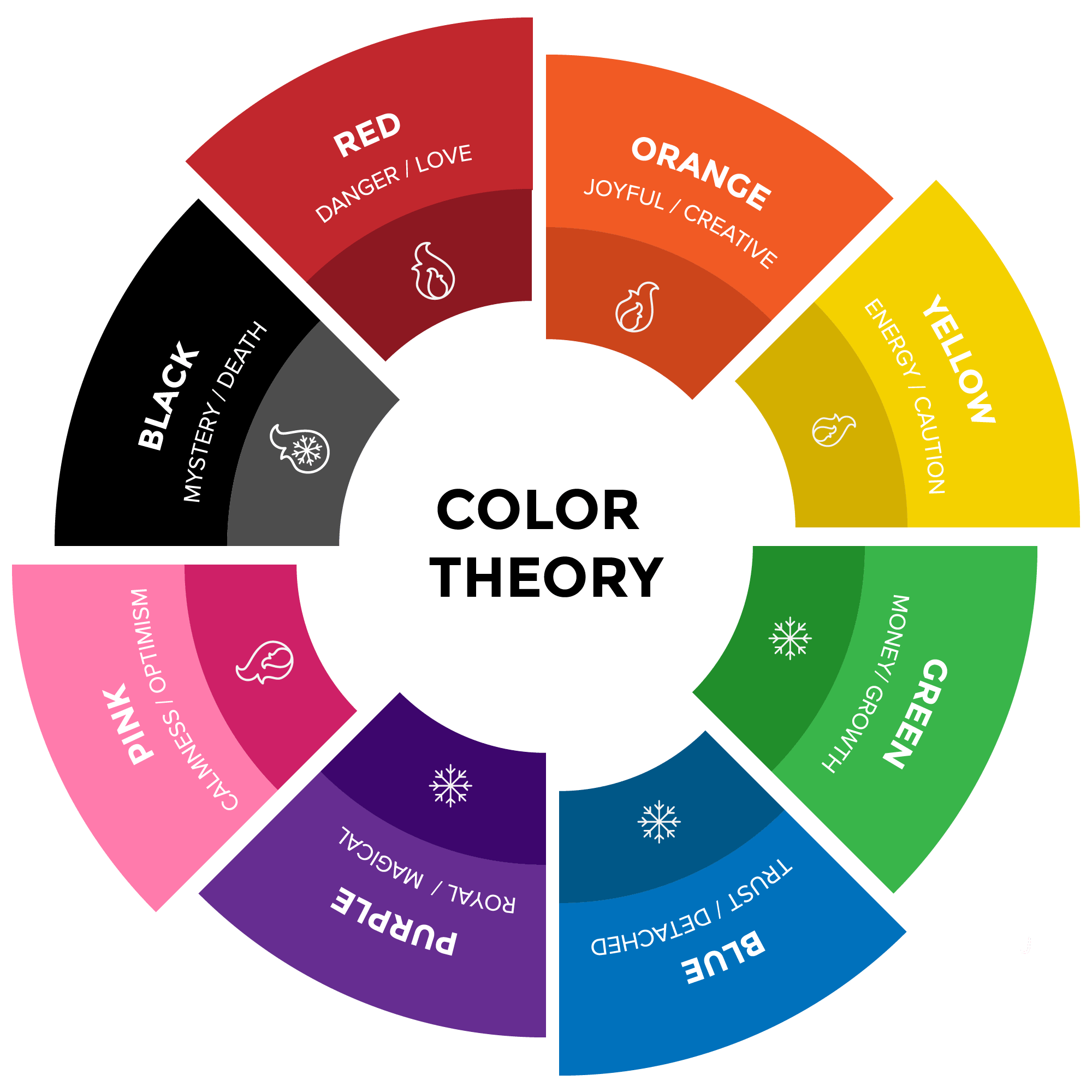
Have you ever felt suddenly hungry seeing a red and yellow logo? Or felt safe when a website is blue? That’s colour psychology in action. Marketers spend millions choosing the right colours because colours directly influence our emotions and behaviour.
🔴 Red
Red increases heart rate and creates a sense of urgency. That’s why “SALE” signs are often red. Red also stimulates appetite – fast food chains like McDonald’s and KFC use red to make you hungrier and buy faster.
🔵 Blue
Blue is the colour of trust, calm and security. Banks (VTB), social media (VK, Telegram) and hospitals use blue to make customers feel safe. Blue also reduces impulsive buying – it encourages rational thinking.
🟡 Yellow
Yellow is the most visible colour. It grabs attention instantly, which is why it’s used for warning signs and discount tags. However, too much yellow can cause eye strain or anxiety. Fast food brands combine yellow with red for maximum impact.
🟢 Green
Green is strongly linked to nature, health and money. Organic food, eco-friendly products and pharmacies often use green. It suggests freshness, growth and sustainability. Vkusvill and Delivery Club are classic examples.
⚠️ Cultural differences
Colour meanings are not universal. In China, red means luck and celebration. In some African countries, red can mean danger. White represents purity in Western weddings, but mourning in parts of Asia. Always know your target audience.
In conclusion, colours are silent salespeople. By understanding their effects, you can make better design choices – or become a more conscious consumer.
Step 3: Reading Tasks
Task A: Complete the table
Scan the text and fill in the table with one emotion/effect and one brand example for each colour.
Colour Emotion / Effect / Example brand (from text or your own)
Example: Red urgency, appetite, fast decisions McDonald's, KFC
Blue _______________ _______________
Yellow _______________ _______________
Green _______________ _______________
Task B: Complete the sentences
Read the text again. Complete each sentence with information from the text (1–3 words).
1. Red increases heart rate and creates a sense of __________.
2. Blue encourages __________ thinking, which reduces impulsive buying.
3. Yellow is the most __________ colour, so it grabs attention instantly.
4. Too much yellow can cause eye strain or __________.
5. Green is linked to nature, health and __________.
6. In China, red means __________, but in some African countries it can mean danger.
7. White represents __________ in Western weddings.
8. The author calls colours “silent __________”.
Task C: True or False?
Decide if each statement is True or False based on the text.
1. Red is often used for sale signs because it creates urgency. (_____)
2. Blue makes people buy things without thinking. (_____)
3. Yellow is the least visible colour. (_____)
4. Green is used by organic food brands. (_____)
5. Colour meanings are the same in every culture. (_____)

Step 4: Writing Task
Situation: You are designing a language learning app for teenagers. Write a comment below (100–120 words) proposing a colour scheme.
Include in your comment:
1. Which colour you choose for the main “Start Lesson” button and why.
2. Which colour you choose for the background and why.
3. One colour you would avoid and why.
4. A question asking for feedback
Useful phrases:
- According to the text, red/blue/yellow/green causes …
- I would choose … for the button because …
- I would avoid … because the text says …
- What do you think about my colour scheme?
Write your colour proposal in the comments below. Good luck!


Комментарии
Отправить комментарий